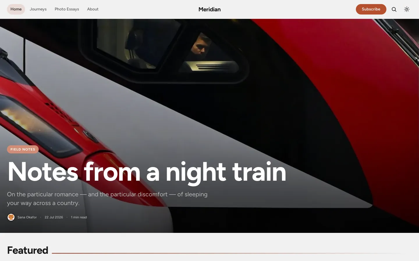
Travel & photography
Meridian
Slow, first-person dispatches from specific places, photo-led. Shows the theme at its most image-forward.
Astrix Ghost Theme is a bold, image-led theme for Ghost CMS — four live demo publications, four hero styles, three feed layouts, native dark mode, membership, and a reading experience that gets out of the way.
Astrix ships one set of components. Change the hero style, feed layout, and accent colour in Ghost Admin, and the same open-source Ghost theme becomes a travel journal, a design magazine, a food publication, or a personal blog.
Slow, first-person dispatches from specific places, photo-led. Shows the theme at its most image-forward.
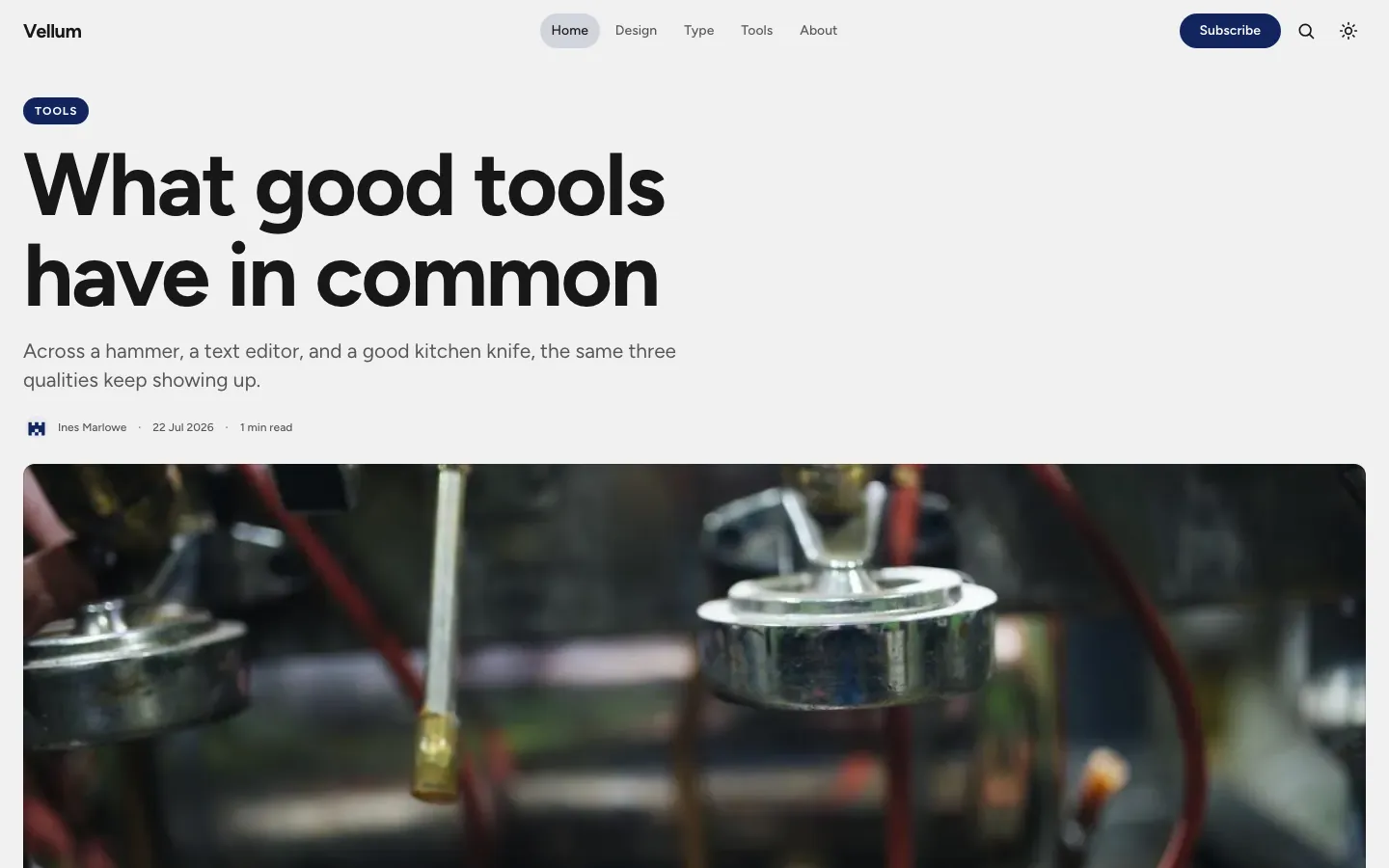
A type-forward journal on design and the craft of making things. Restrained, editorial, opinionated.

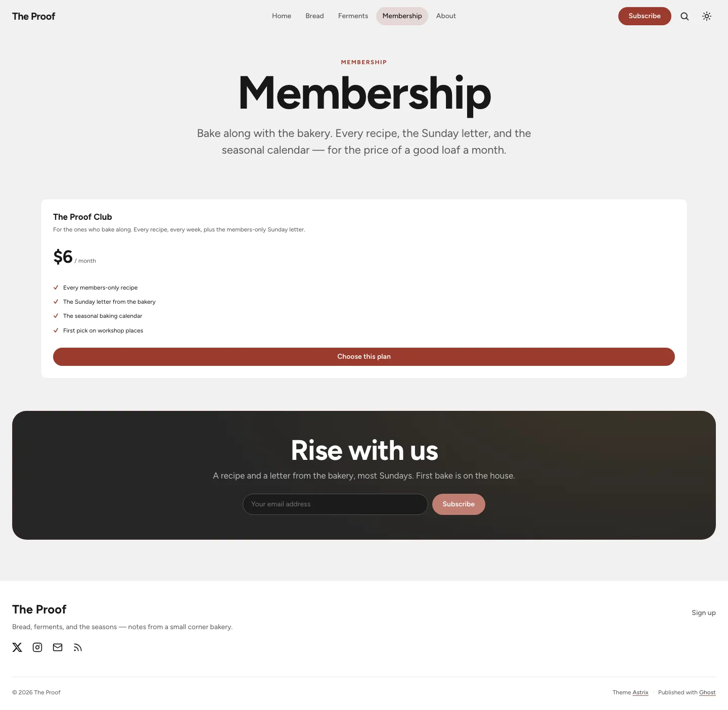
Recipes and essays from a small corner bakery — with paid membership, gated recipes, and a pricing page.
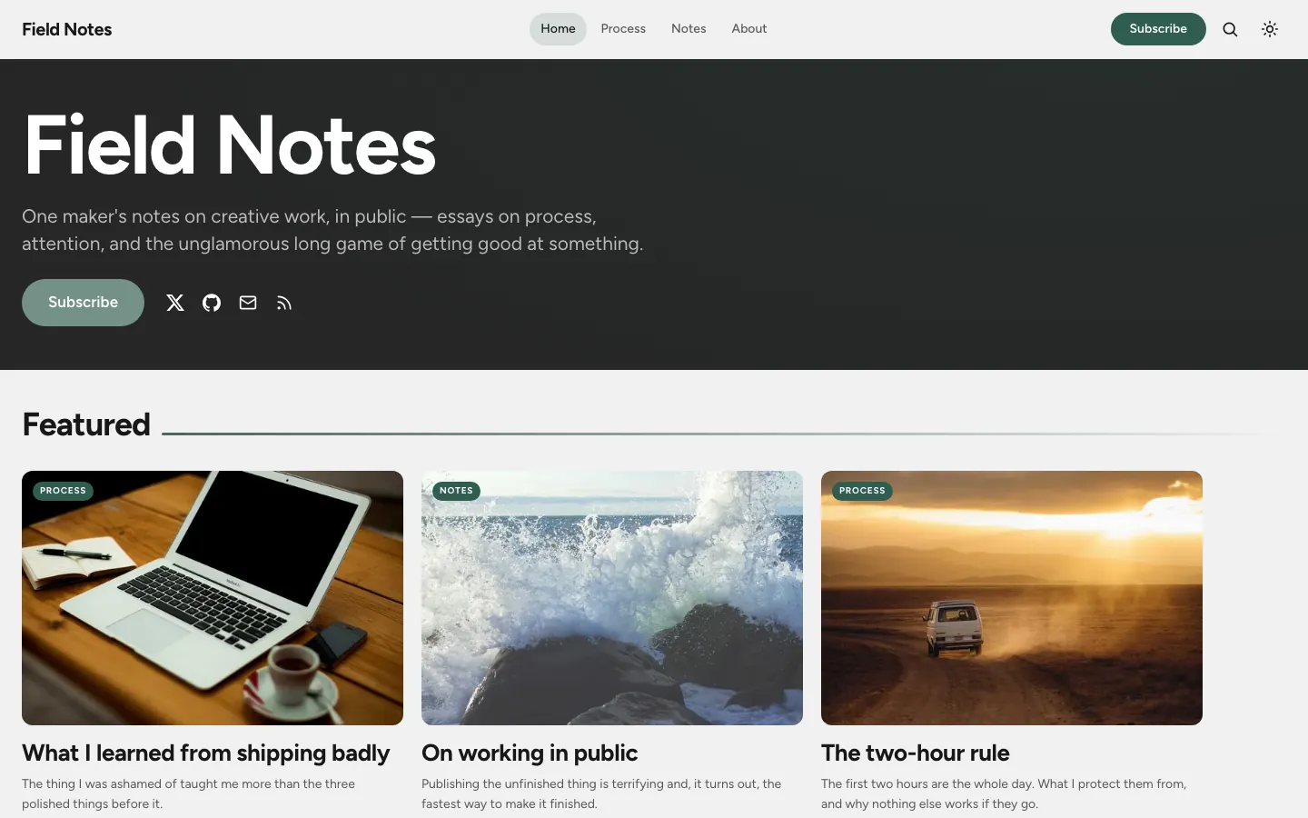
One maker's notes on creative work. The Personal hero puts the author front and centre, with a supporter tier.
The homepage opens in one of four ways, selectable in Ghost Admin → Design. Poster and Editorial lead with the latest featured post; Split balances image and text; Personal opens with the author.
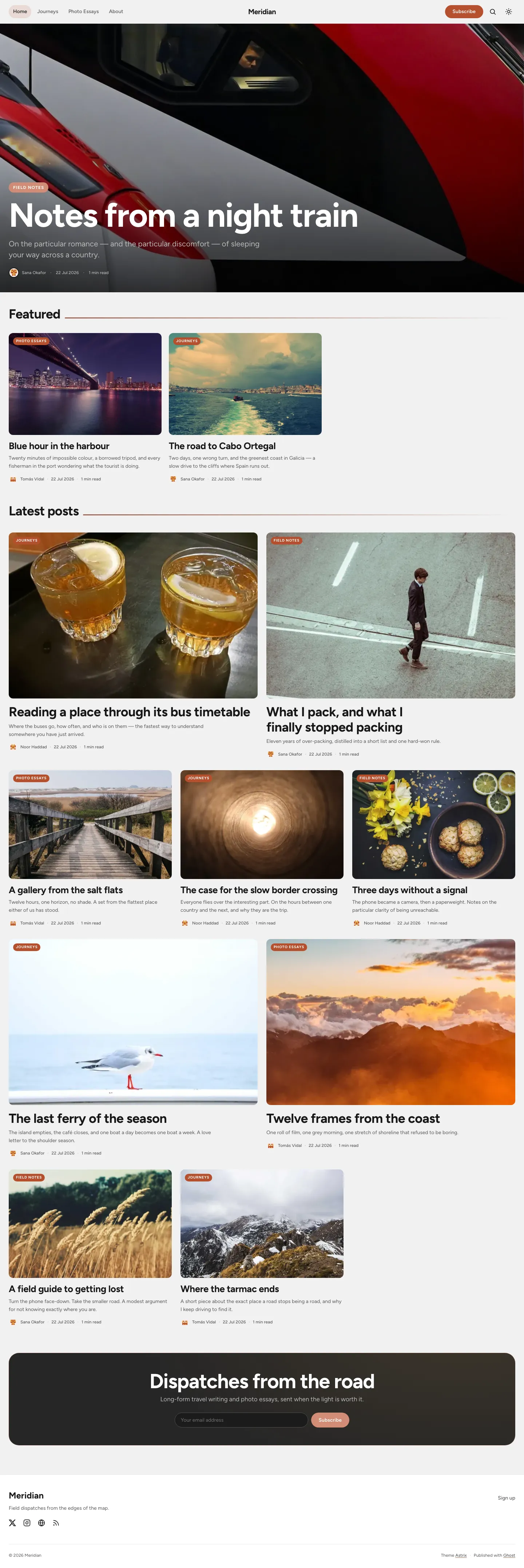
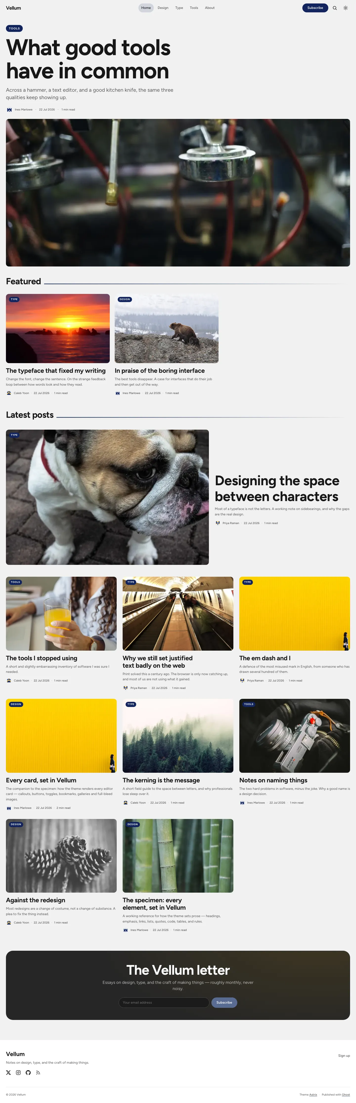
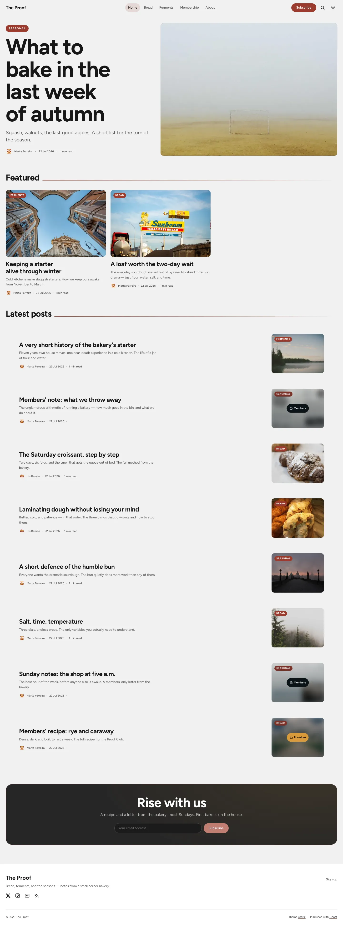
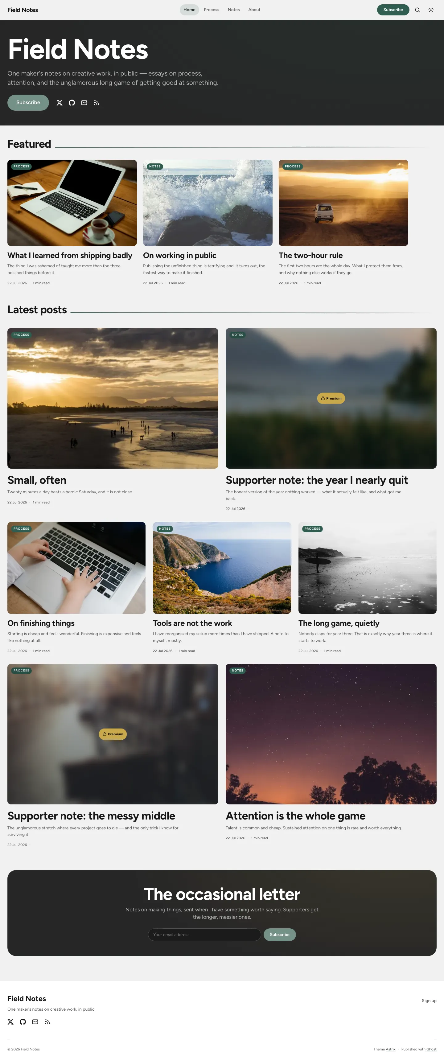
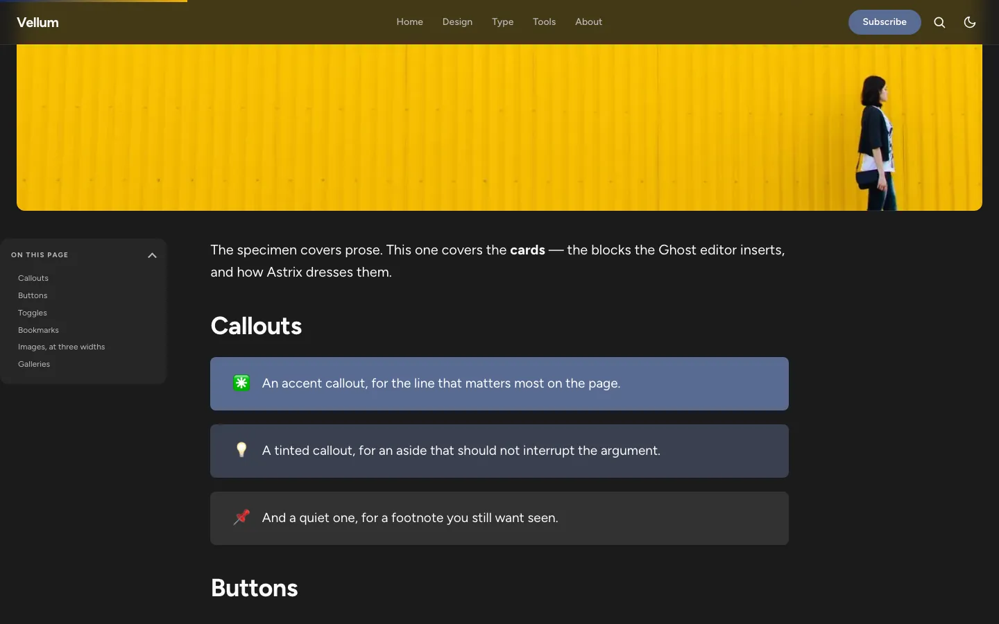
Mosaic, Bold grid, and List — plus a native light / dark / system colour scheme with a zero-flash toggle, driven by light-dark(). Every accent stays readable in both schemes.
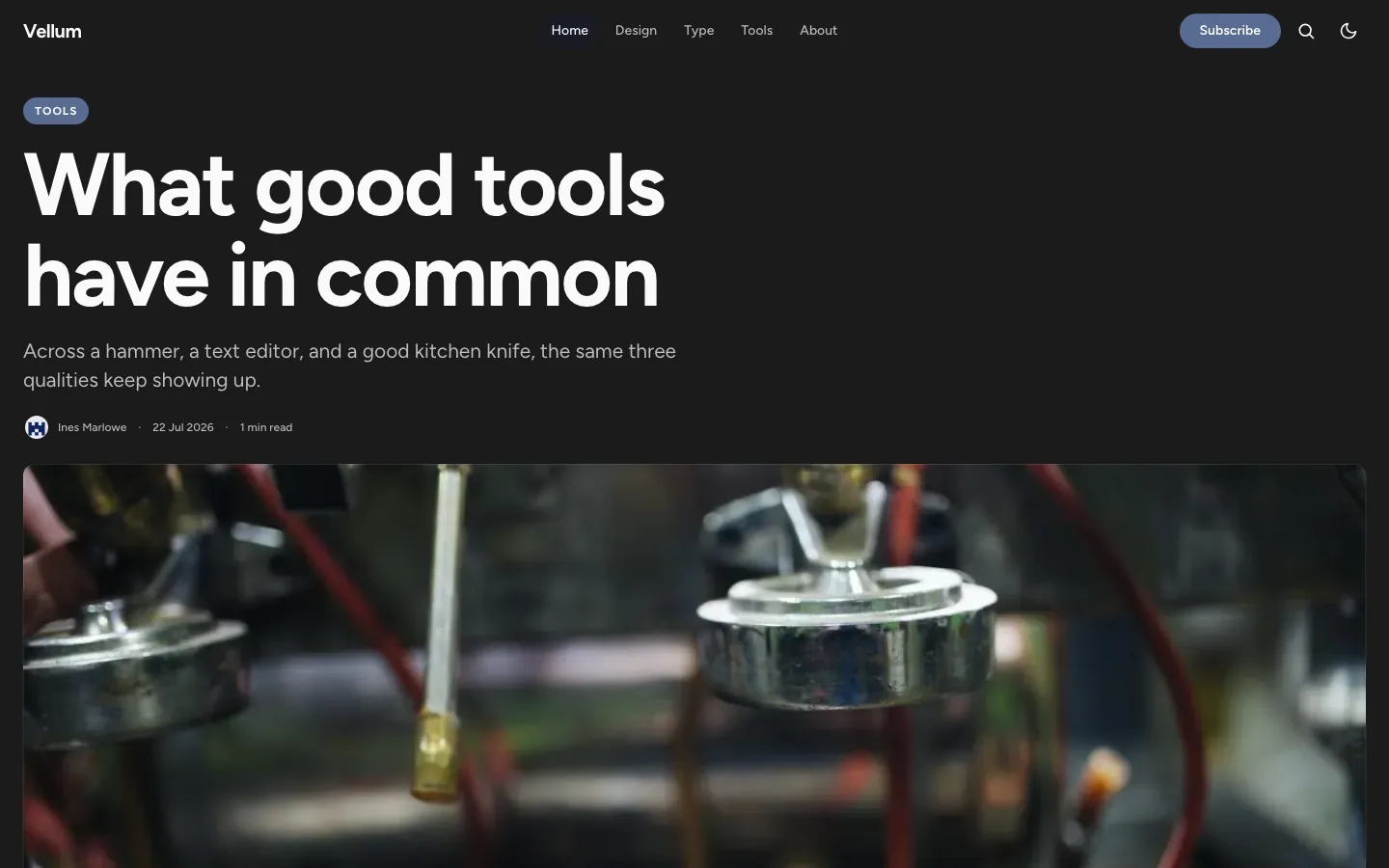
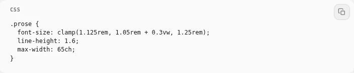
A sticky table of contents with a reading-line scrollspy, a reading progress bar, related posts, and a reading-scale prose measure — with fully styled headings, lists, quotes, code, and tables.
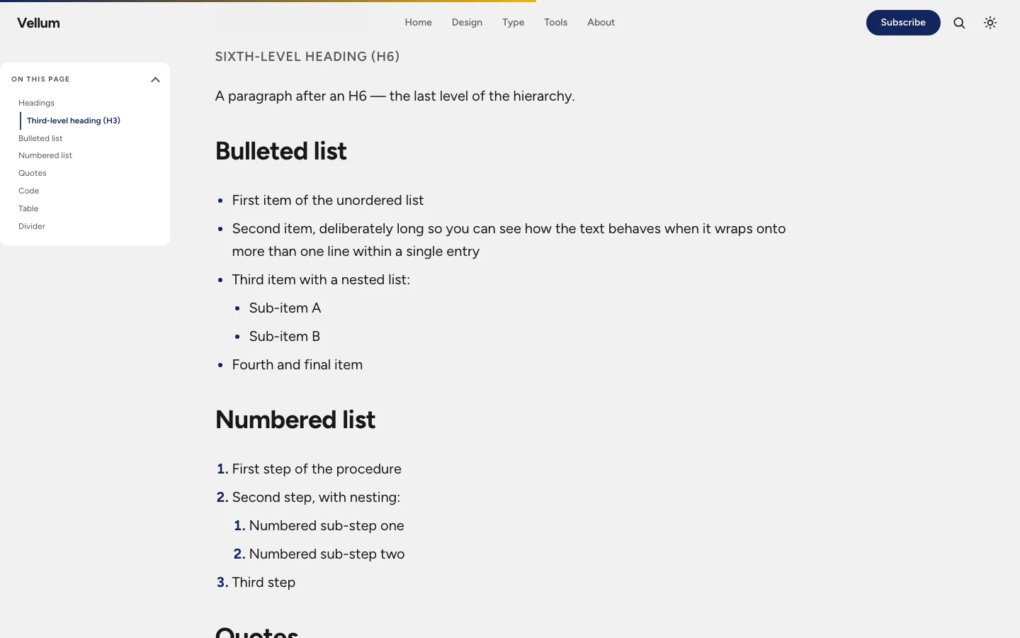
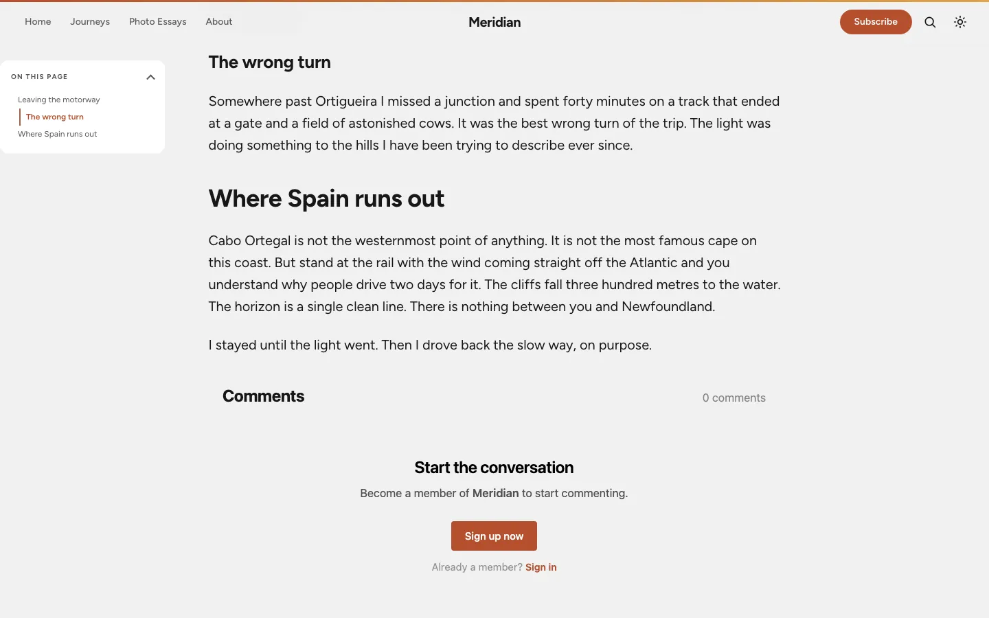
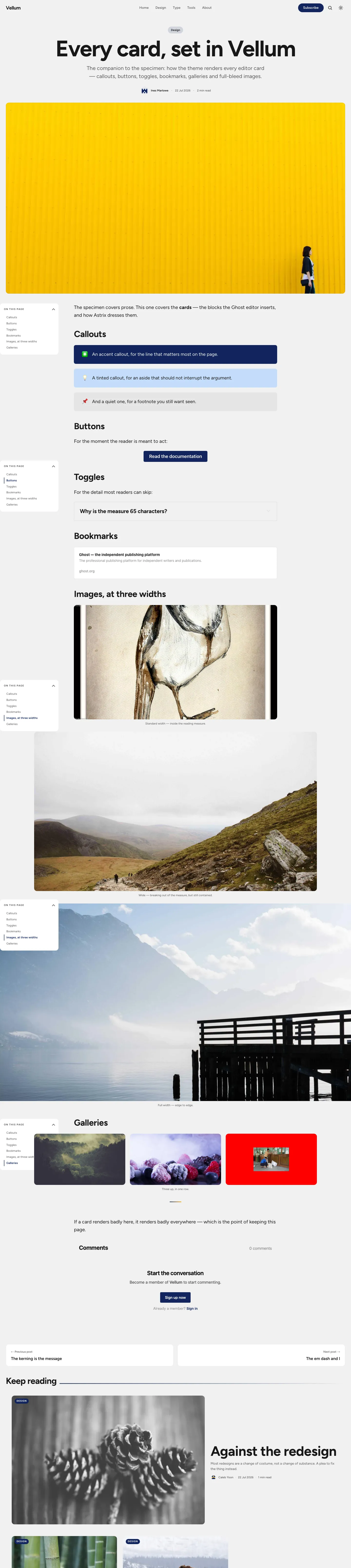
Callouts in every colour, buttons, toggles, bookmarks, galleries, and images at three widths — standard, wide and full-bleed. The demo ships a page that exercises all of them, so nothing renders as an afterthought.
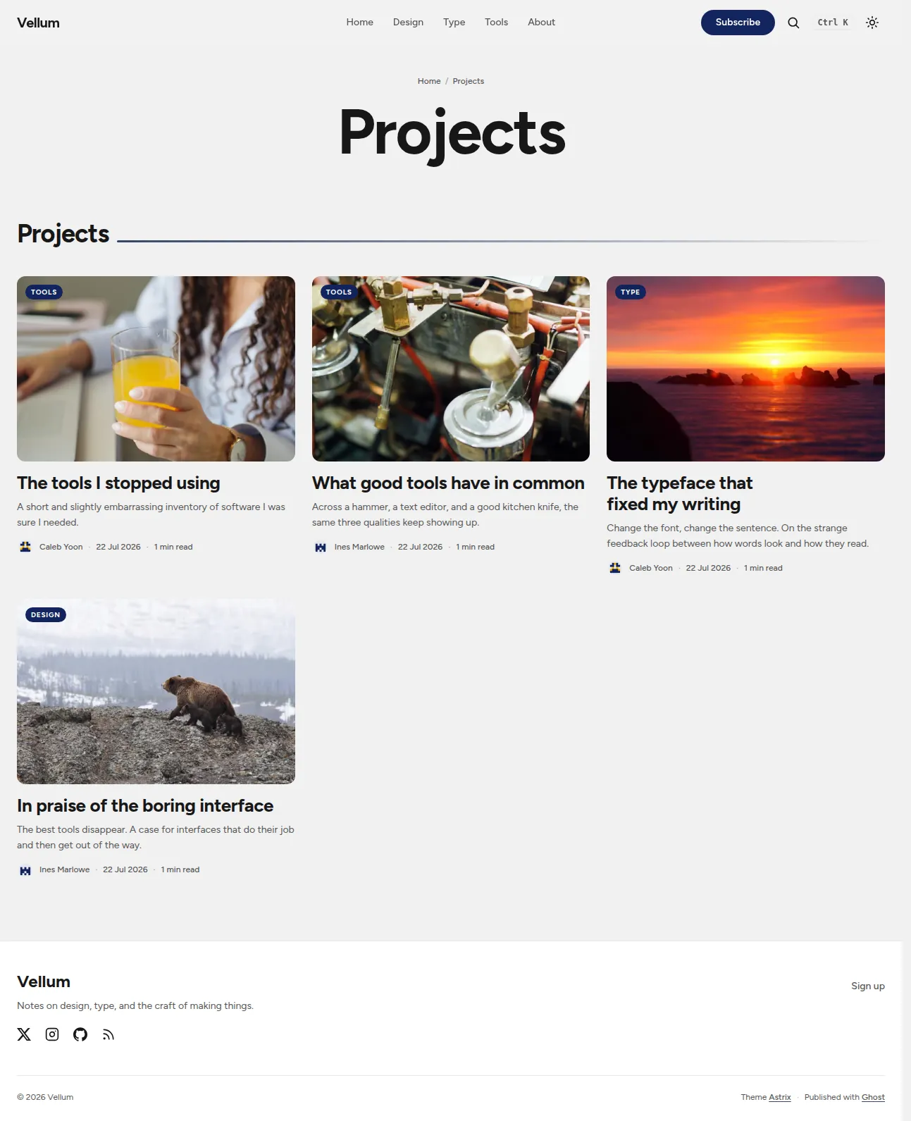
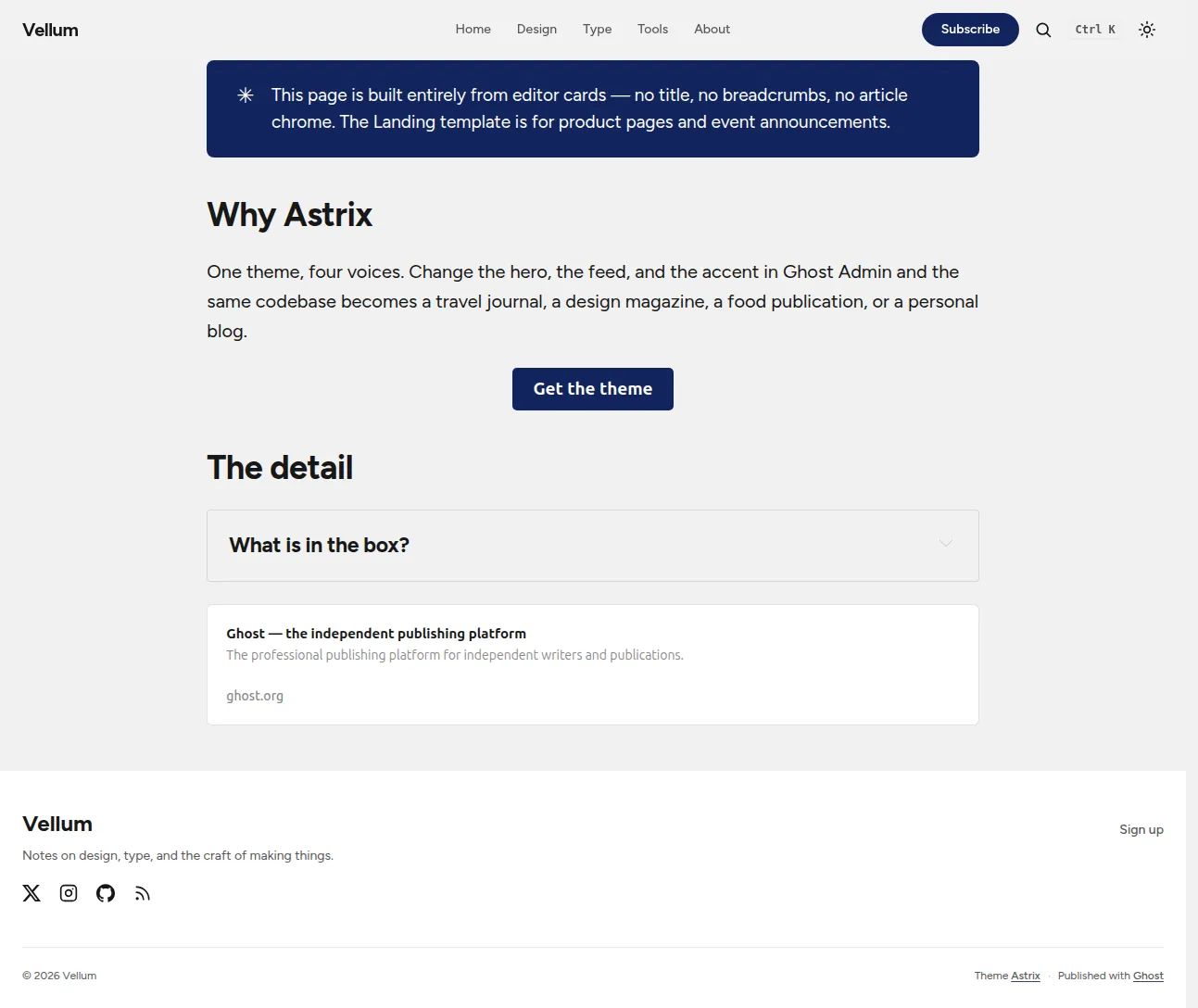
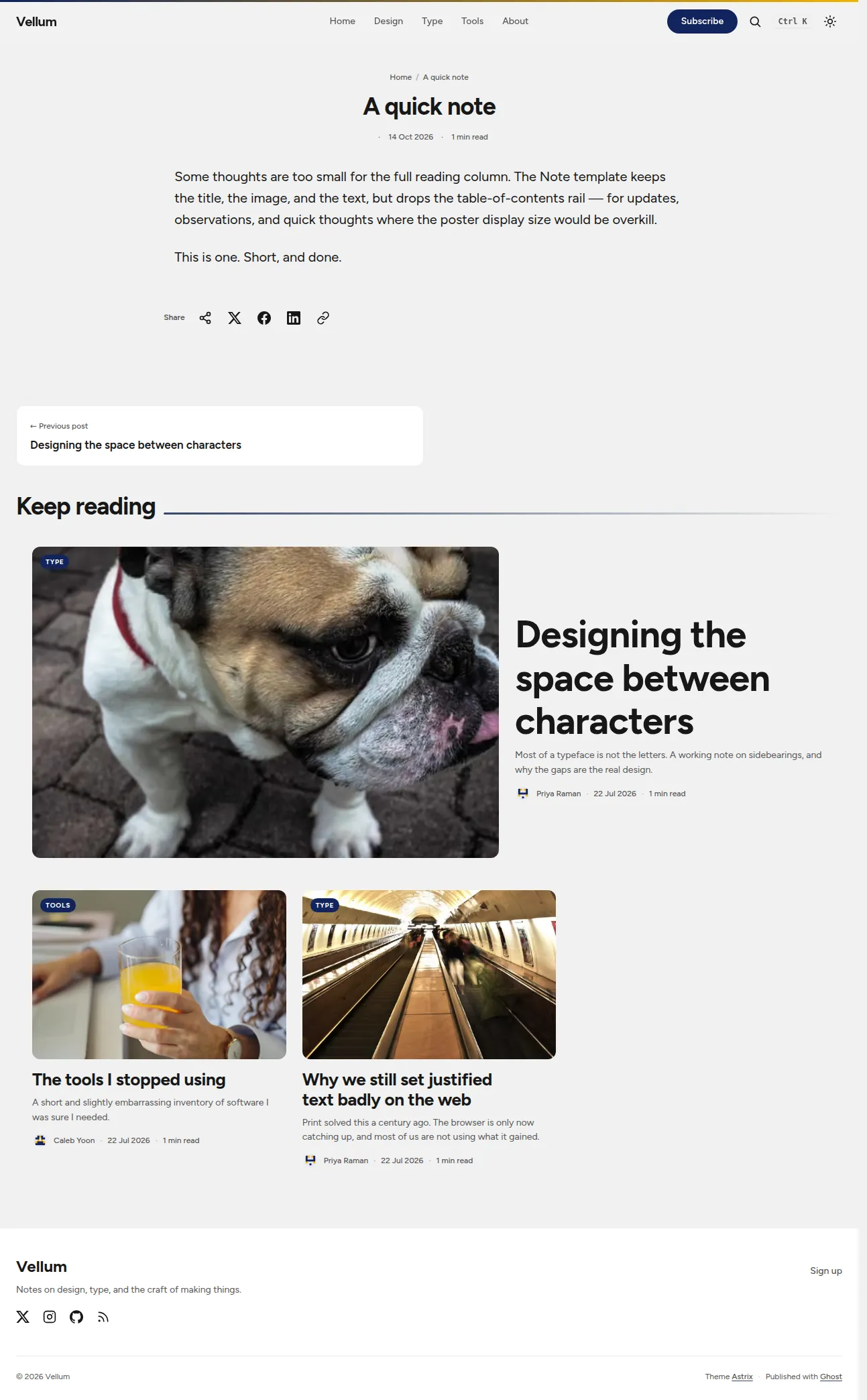
Assign a page template by page name in Ghost Admin (Settings → Pages → edit → Template); the Note template is a post template, picked per-post in the editor. No code, no child theme.
| Template | Type | What it does |
|---|---|---|
| Portfolio | page | The page content, then a uniform responsive grid of project posts tagged #portfolio or #project, newest first. |
| Landing | page | The page content built entirely from Koenig cards, with no title, breadcrumbs, or article chrome — for product pages and event announcements. |
| Note | post | A compact reading column that keeps the title, image and text but drops the table-of-contents rail — for updates, observations, quick thoughts. |
| Archive | page | The page content, every public tag with its post count, then the full post index (grouped by year with JS). |
| Newsletter | page | The page content, a prominent subscribe form, then past editions (posts tagged with the internal #newsletter tag). |
| Membership | page | A pricing grid built from the publication's tiers, with a tier-aware CTA. |
language-* classAn optional routes.example.yaml at the repository root shows how to serve a static home with the blog under /writing/; without it the post feed lives at / (what the four demo publications run).
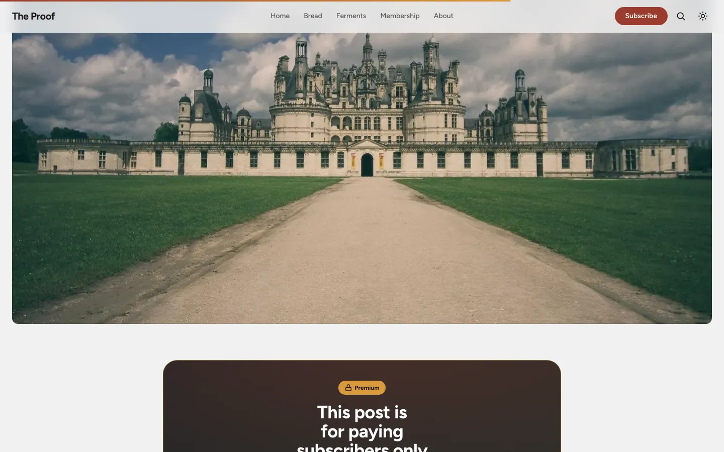
Portal integration, subscribe forms, a custom-membership pricing page, and tier-aware gates for members-only and paid content.
Every layout is built mobile-first: thumb-friendly navigation, 44px touch targets, and full-bleed imagery that holds up on a small screen.




The Ghost Admin accent is derived into fill, ink, and line tokens so it stays legible on both light and dark.
Built on the Astryx design tokens (colour, spacing, radius, motion, type) — no hard-coded values.
sodo-search wired in, plus fully styled Koenig cards: callouts, bookmarks, galleries, toggles, products.
⌘K / Ctrl+K opens Ghost's native search from anywhere, and / does the same when you're not typing. A desktop kbd hint shows the right keys for your platform.
Where the browser supports it, the post share row leads with the system share sheet, ahead of the X / Facebook / LinkedIn / copy anchors. Hidden without JavaScript or on unsupported browsers.
Each code block shows a quiet uppercase badge (TS, Python, …) read from Koenig's language-* class, in the code font and secondary text colour.
Markdown footnotes render with an accent superscript reference, a hairline list, a quiet back-reference, and a brief accent flash on the target note — skipped under reduced motion.
Up to four of the publication's recommendations — favicon, title, readable URL and description — above the footer meta row, opening in a new tab. The section renders only when the site has recommendations.
With donations enabled in Ghost Admin, a Support this site button opens Portal's support flow from the site footer and the post share row. Both are gated on donations, so nothing renders — and no space is reserved — when they're off.
Posts, pages, tags and authors render a breadcrumb trail carrying BreadcrumbList microdata; the last crumb is the current page, marked aria-current="page".
English and Italian are maintained; German, Spanish, French, Portuguese and Dutch ship too. Every UI string goes through {{t}}.
Ghost Admin custom fonts are honoured; Figtree is self-hosted with a zero-CLS fallback.
WebP imagery, lazy-loading, content-visibility, focus states, reduced-motion support, and axe-core checks that run against a real render in both light and dark on every change.
All configurable from Ghost Admin → Design — no code required.
| Setting | Options | Default |
|---|---|---|
| Header style | Editorial / Poster / Split / Personal | Poster |
| Feed layout | Bold grid / Mosaic / List | Bold grid |
| Colour scheme default | System / Light / Dark | System |
| Navigation layout | Logo left / Logo middle | Left |
| Secondary accent | colour | #f5b301 |
| Personal hero headline / text / portrait | free text / image | empty |
| Show author meta | Name and avatar / Name only / Hidden | Name and avatar |
| Featured slider | on / off | on |
| Table of contents | on / off | on |
| Reading progress | on / off | on |
| Related posts | on / off | on |
| CTA headline / text | free text | built-in copy |
| Social: GitHub / Hugging Face / email / extra URL | text | empty |
Astrix speaks in two accent voices. Ghost's Brand colour is the navy identity voice — buttons, active nav, links, section rules. The theme's Secondary accent is the gold response voice — hover, focus, text selection, the subscribe button, premium badges. Changing one doesn't repaint the other; that's by design. The Brand colour is applied through derived tokens so it stays legible on both light and dark, and those tokens are computed rather than separate Admin controls. Every setting carries an in-Admin description, and the mapping is spelled out in the README.
astrix.zip from the latest release.